如何设计更好的面包屑导航
没有人会对面包屑导航感到特别兴奋。这些微小的路径碎片说明了用户当前在网站错综复杂的层次结构中的位置。它们的设计看起来很明显,他们在页面上的位置也是如此,看起来面包屑发光不需要太多的创新。
事实证明,有很多细微的小细节可以使面包屑变得混乱或无限地更有用。在本文中,我们将仔细研究其中的一些。我们将探索我们何时真正需要面包屑,用户如何使用它们,以及如何更好地设计它们以加快用户在我们网站上的导航。
让我们首先探索人们如何浏览网站,以及面包屑究竟如何帮助我们的旅程。
如何浏览网站
每个可用性测试都表明,没有单一的、通用的和完善的网站浏览方式。根据手头的任务和访问频率,用户应用非常不同的导航模式。在某些网站上,几乎不使用搜索但主导航得到很多关注的情况并不少见。在其他方面,类别几乎没有任何点击,但搜索查询却在屋顶。有时面包屑恰好是整个网站上最受欢迎的导航选择。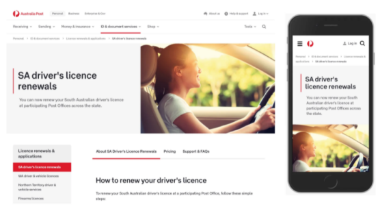
以澳大利亚邮政为例,各种导航需要协同工作。全局导航栏、主导航、面包屑、侧边栏和选项卡。用户可以在各个级别之间跳转,他们可以使用面包屑轻松地向后移动,使用顶部的水平导航向前移动,使用侧边栏导航横向移动以及使用选项卡在页面的各个部分中切换上下文。
我们很少逐个浏览每个部分,甚至很少注意到网站上所有可用的导航。对于经常访问的网站,例如新闻网站,我们将使用非常有限的一组页面和功能。事实上,我们可能无法记住我们单击了哪些功能和部分,但我们可能会记住它们在界面中的位置。
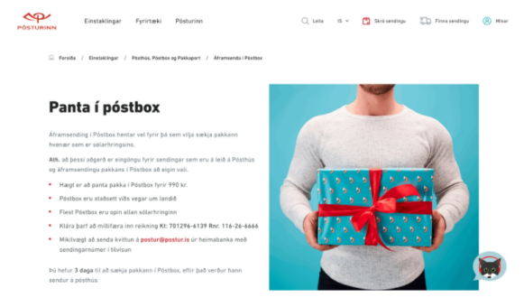
一旦你登陆页面,你将如何理解你在哪里?在这里,面包屑有很大帮助。示例:冰岛邮政服务
当我们登陆一个我们以前从未访问过的网站时,例如国家歌剧网站,我们首先评估选项和功能的广度。这通常是通过上下滚动页面来实现的——先是慢,然后是更快——并熟悉导航菜单。我们点击侧边栏,在选项卡之间切换并打开大型下拉菜单。我们只是四处游荡,相信导航路标和我们极其不可靠的预感。我们扫描、识别模式并相信我们的直觉。
有时,如果我们找不到我们所追求的东西,我们的旅程就会变成对各种页面和类别的疯狂探索——通常是紧张的、混乱的、耗时的和令人沮丧的。如果有任何事情没有按预期工作,我们就不再使用它,因为我们不再信任它。一旦我们真的没有任何选择,我们就会完全放弃。
有时,重新设计的网站会导致流量大幅下降。这不是因为出了什么问题。相反:我们在用户所在的地方遇见用户,直接显示答案,因此无需访问网站。
但是,当几乎不使用导航和搜索时,不一定是因为网站设计或构建不佳。相反:内容可能组织得非常好,以至于人们实际上很快就找到了他们需要的东西——甚至可能在首先访问网站之前,仅仅通过浏览谷歌的搜索结果。一旦他们这样做了,就没有太多理由留在网站上。
虽然我们经常关注退出率和跳出率以及在页面上花费的时间,但这些指标很少能揭示用户在网站上所做的事情的完整故事。有人在给定页面上花费 4:30 分钟这一事实不一定是一个好的指标。有人在 30 秒内离开这一事实并不一定是坏事。
为了跟踪用户对导航(和搜索)的理解和使用情况,我们需要跟踪用户在手头任务上的成功程度。您可以将其视为在较长时间内建立和研究的设计 KPI 。值得收集有关以用户为中心的指标的见解,例如:
- 任务完成率,
- 任务完成时间,
- 第一次分享的时间,
- 客户支持查询,
- 负面评论的比率,
- 提交数据的准确性

转发导航
我们访问网站是有原因的,在某些网站上,它可以像检查银行账户或探索大型数据集一样具体。因此,一旦我们最终进入主页或仪表板,我们就会在网站的层次结构中向前移动,从非常广泛的页面到非常具体的页面,以尝试完成我们已经着手完成的任务。
结合了多种导航方向——通过主导航、侧边栏导航、页内导航和面包屑导航,可以轻松向前、向后和横向导航。一次全部。
在导航方面,我们从主页移动到一个类别,再到子类别,再到进一步的页面内导航,以找到我们最终需要点击的特定功能。如果幸运的话,我们可以跳过整个旅程,并更早地从大型下拉菜单或号召性用语中获得该功能。作为设计师,我们越能缩短意图和行动之间的距离,用户体验就会越好。
向后导航
不过,我们并不总是有一个特定的任务。通常情况下,我们的目标是多方面的,我们会改变主意,忽略事物,做出自发的决定,并因闪烁的通知而分心。因此,我们的数字旅程很少是严格线性的,尤其是当网站上的导航有些复杂时。在这种情况下,我们最终会倒退。事实上,我们后退是为了重新定位自己,选择一条探索的路线,然后朝着另一个方向前进。然后我们再次跳同样的舞蹈,一次又一次,直到我们实现了我们的意图。在许多方面,这个过程类似于写一篇这样的文章。有一个总体思路可以推动文章向前发展,但也有绊脚石和重新考虑让你退缩。
在网络上,尤其是当我们最终进入一个似乎无处可寻、内容过时、没有提供急需功能的页面,或者当我们的搜索查询过于模糊而无法提供准确和相关的结果时,就会发生这种情况。

德意志银行的导航不会突出显示用户当前所在的位置。
我们经常使用的一个简单测试是给用户一个 URL,并要求他们解释他们目前在网站的哪个部分,并找到相似或相关的部分。在上面的德意志银行示例中,这会有点困难,因为导航中没有当前页面的亮点。
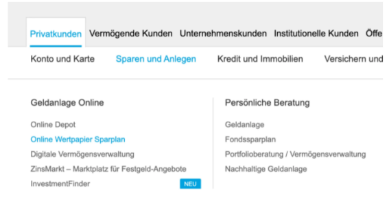
默认情况下,当前导航级别不会在导航栏中突出显示。
事实证明,我们处于导航的第三级。通常“spare and anlegen”应该处于活动状态并在页面上突出显示,但事实并非如此。只有当我们打开一个悬停菜单时,我们才能发现当前页面实际上是什么。在德意志银行,向后导航有点麻烦。
横向导航
好像来回走动还不够,有时我们还会横着走——在各个级别、部分、页面和子类别之间猛烈地上下跳跃。这通常发生在我们想要探索类似的主题或相关页面,或者探索以某种方式与当前页面相关的更多信息时。当我们浏览可用选项但尚未下定决心时,也会发生这种情况。基本上,我们探索、浏览和点击,试图创建一个我们面前的综合图片。

奥地利邮政服务支持横向导航,右侧有附加信息侧边栏。
正如我们所做的那样,我们需要指引我们朝着正确方向前进的路标。事实上,考虑到发生了多少运动,对我们的导航方式进行一致且可预测的跟踪肯定会有所帮助。事实上,这正是面包屑提供的。
乍一看,面包屑似乎只对向后导航有帮助,但我们经常使用它们向后移动,找到更好的路线并再次向前移动。通过这种方式,它们服务于所有方向的导航,并且做得很好。
上面列出的所有选项确实提供了方向感,但它们也需要相当多的水平或垂直空间才能做到这一点。在整个用户旅程中,它们需要是可见的,以引导用户从一个页面移动到下一个页面。如果它们在其中一个页面上突然消失,用户很可能会迷路。在搜索结果中添加健康剂量的噪音和稍微繁琐的导航,我们不应该对用户在查找他们正在寻找的内容时遇到问题感到惊讶。
相比之下,面包屑简洁、紧凑、集中,并且可以很好地完成工作。它们不是显示所有级别的导航,而是指示页面所在的位置,以及对其所有父级的快速访问,一直到主页。有时这正是我们所需要的:不多也不少。
面包屑清单
并非每个面包屑导航都会出现并且工作方式相似。我们已经看到了一些非常不同的模式和细微的细节,其中面包屑的设计和实现有所不同。像往常一样,这里是设计更好的面包屑时要考虑的一些重要指南的一般清单:
- 面包屑总是需要补充主导航。
- 面包屑最适合全局导航。
- 它们也可能出现在主标题上方。
- 分隔符应指向右侧(在 RTL 接口中)。
- 面包屑应该是可见的,无需滚动。
- 避免“禁用”面包屑并将所有面包屑变成链接。
- 如果面包屑位于标题上方,则可以删除当前页面。
- 否则,为了清楚起见,将当前页面包含在面包屑中。
- 在移动设备上,如果需要,使用手风琴显示完整路径。
- 当前页面的父页面应该始终可见。
- 对于您的用户来说,横向面包屑可能是一个非常令人惊讶和有用的发现。

以上就是速优网络和大家分享的"如何设计更好的面包屑导航",非常感谢您有耐心的读完这篇文章,我们将为您提供更多参考使用或学习交流的信息。我们还可为您提供:企业网站建设、网站仿制、网站复制、仿站、外贸网站建设、外贸建站、公司官网制作等服务,本公司以“诚信、专业、务实、创新”的服务理念服务于客户。如您需要合作,请扫码咨询,我们将诚挚为您服务。
TAG标签:


