网站前端制作页面常用效果
网站的内容包罗万象,设计里透出很多别出心裁,页面的框架或者页面中的小细节小效果都能体现出来。在这些网站的制作中,有一些小效果经常能用到,借此记录下来,下面的这几种小效果都是比较常用的,而且都是用css就能完成的。譬如:页面中的一些下拉框或者气泡框的小三角形、页面内容的翻转、文字的背景和头部的搜索框的效果。诸多这些效果组成一个个很不错的网站。
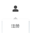
制作下拉框的小三角形,如下图:
Css如下:
.other ul li::before{
content: '';
position: absolute;
top: -8px;
left: 50%;
display: inline-block;
width: 0;
height: 0;
border-style: solid;
border-width: 0 8px 8px;
border-color: transparent transparent #d5d5d5 transparent;
-webkit-transform: translateX(-50%);
transform: translateX(-50%);
}
border-width修改小三角的大小,border-color的可以设置小三角的颜色和指向方向。
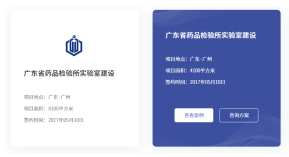
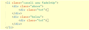
页面内容翻转效果,如下图:
Html:
.caseli .above{
padding-top: 7%;
background: #FFFFFF;
position: relative;
-webkit-transform: rotateX(0deg) rotateY(0deg);
-webkit-transform-style: preserve-3d;
-webkit-backface-visibility: hidden;
-moz-transform: rotateX(0deg) rotateY(0deg);
-moz-transform-style: preserve-3d;
-moz-backface-visibility: hidden;
transform: rotateY(0deg);
-webkit-transition: all .4s ease-out;
-moz-transition: all .4s ease-out;
transition: all .4s ease-out;
z-index: 24;
box-shadow: 0px 5px 38px rgba(0,69,87, 0.09);
border-radius: 10px;
}
.caseli:hover .above{
z-index: 35;
-webkit-transform: rotateY(180deg);
-moz-transform: rotateY(180deg);
transform: rotateY(180deg);
-webkit-transition-delay: .2s;
-moz-transition-delay: .2s;
transition-delay: .2s;
}
.caseli .below{
position: absolute;
left: 0;
top: 0;
width: 100%;
height: 100%;
background: url(../images/img32.jpg) center no-repeat;
background-size: cover;
box-shadow: 0px 5px 38px rgba(0,69,87, 0.09);
-webkit-transform: rotateY(-180deg);
-webkit-transform-style: preserve-3d;
-webkit-backface-visibility: hidden;
-moz-transform: rotateY(-180deg);
-moz-transform-style: preserve-3d;
-moz-backface-visibility: hidden;
transform: rotateY(-180deg);
-moz-transition: all .4s ease-out;
-webkit-transition: all .4s ease-out;
transition: all .4s ease-out;
z-index: 13;
border-radius: 10px;
}
.caseli:hover .below{
display: block;
-webkit-animation: fadeIn 0.8s;
animation: fadeIn 0.8s;
}
.caseli:hover .below{
z-index: 46;
-webkit-transform: rotateX(0deg) rotateY(0deg);
-moz-transform: rotateX(0deg) rotateY(0deg);
transform: rotateY(0deg);
-webkit-transition-delay: .2s;
-moz-transition-delay: .2s;
transition-delay: .2s;
}
Css实现给文字添加背景,如下图
.i-title .tsp{
position: relative;
display: inline-block;
padding: 0px 166px;
font-weight: bold;
font-family: "syh";
color: #ec3f41;
text-transform: uppercase;
line-height: 1.2;
background-clip: text;
-webkit-background-clip: text;
-webkit-text-fill-color: transparent;
color: transparent;
background-image: url(../images/img9.jpg);
background-position: center left;
background-size: cover;
}
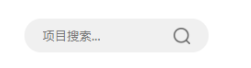
页面中常见的搜索框,鼠标移上去之后宽度就会变大,如下图:
Css:
.searchbox{
width: 80px;
height: 40px;
border-radius:40px;
border:1px solid #EEEEEE;
position: absolute;
right: 0;
outline:none;
text-indent:12px;
color: #333333;
font-size:15px;
padding:0;
-webkit-transition:width 0.4s;
transition:width 0.4s;
}
.searchbox:hover{
width:200px;
}

以上就是速优网络和大家分享的"网站前端制作页面常用效果",非常感谢您有耐心的读完这篇文章,我们将为您提供更多参考使用或学习交流的信息。我们还可为您提供:企业网站建设、网站仿制、网站复制、仿站、外贸网站建设、外贸建站、公司官网制作等服务,本公司以“诚信、专业、务实、创新”的服务理念服务于客户。如您需要合作,请扫码咨询,我们将诚挚为您服务。
TAG标签:


